Knowledge graphs
A knowledge graph stores your operation as things connected by named relationships, rather than as rows in tables that have to be joined back together.
The practical difference: you can ask questions that follow a chain of connections of unknown length. "What else does this switch affect?" is one question, not a different query for every possible depth.
Rows versus connections
A conventional database stores facts in tables and reassembles them with joins. That works beautifully when you know in advance which tables a question will touch.
Operational questions are not like that. They are usually of the form "start here and follow whatever connects, until you find what matters", and the number of hops is not known when the question is asked.
"What is the blast radius of taking down SW-04?", in a graph, you walk outward from SW-04 and collect what you reach. Two hops, four hops, however far the chain runs; the question is the same shape either way. In tables, each additional hop is another join, and the query has to be rewritten every time the answer might be deeper than you guessed.
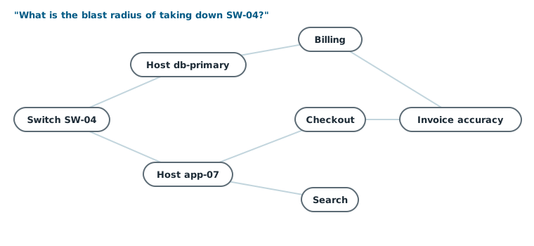
This is why DataHub keeps the ontology in a graph specifically: the questions users ask of it are traversals, and traversals are what a graph is for.
The questions it makes cheap
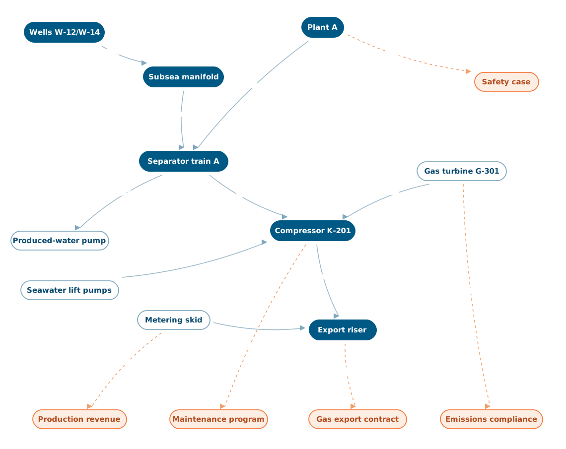
These are the kinds of questions a knowledge graph turns from a project into a query. Each one is a walk across relationships:
| Question | The walk |
|---|---|
| Which assets under this process saw abnormal readings during yesterday's shift? | Process → the assets serving it → their time series → filter by time and threshold |
| This KPI moved. What contributed? | KPI → the functions feeding it → the assets performing them → their signals and events |
| We are taking this transformer out. What loses supply? | Transformer → everything it powers → everything those power, recursively |
| This reading looks wrong. Where did it come from? | Value → its lineage → transformations → raw measurements (this walk is planned, arriving with lineage) |
| A permit was opened on this vessel. What is affected downstream? | Vessel → downstream connections → their current signals |
None of these require anyone to have anticipated the question. The relationships were recorded because they are true, not because a report needed them, which is exactly why the model keeps paying off for questions nobody thought of when it was built.
What it looks like in the console
The Resources view draws your graph directly. Nodes are resources, coloured by their label; lines are relationships.
- Click a node to make it the centre and see what it connects to.
- Expand its relations to pull the neighbours into view, which is how you follow a dependency chain visually: one hop at a time, outward from wherever you started.
- Filter by relationship type, so the edges carrying flow stay lit while the containment hierarchy dims, and one route through a dense graph becomes readable.
- Animate a relationship to watch a data type travel from source node to target node, making a flow legible at a glance.
- Stabilise the layout when a dense area gets tangled.
Tracing a whole route in one action, where everything off the path dims at once, is on the roadmap; today the same question is answered by expanding and filtering.
Working with the resource graph →
The visual view is genuinely useful for exploration and for explaining the model to somebody, but the value is not the picture. It is that the same relationships are available to every query, report, alarm and model behind the scenes.
Why a graph and not just a hierarchy
Many asset-information systems offer a hierarchy: site contains area contains unit contains equipment. That is useful and it is not enough, because real operations are not trees.
A pump belongs to a process line and to a maintenance route and to a cost centre and to a safety-critical equipment register. In a tree, you must choose one and duplicate the rest. In a graph, the pump is one node with four different relationships, each named for what it means.
That difference decides whether the model can serve more than one department. A tree serves whoever won the argument about what the tree should be organised by. A graph serves everyone, because each perspective is just a different set of edges.
What makes a graph good or bad
A knowledge graph is only as useful as the relationships in it. Three failure modes to watch for:
- Vague relationship names. A model full of related to relationships is a picture, not a model, you cannot traverse it meaningfully because the edges do not mean anything specific. Name relationships for what they actually assert.
- Direction ignored. Monitors and is monitored by are different facts. Pick a direction convention and hold to it, or traversals will return nonsense in one direction.
- Orphans. A resource with no relationships is invisible to every traversal. In DataHub refuses a delete that would leave a resource with no path to the rest of the graph, which is a deliberate nudge: things in the model should be connected to something.
Naming relationships properly →
How it connects to everything else
The graph is not a separate feature; it is the spine.
- Time series hang off the resources they measure, so a signal always knows what it is measuring. Time series →
- Events are anchored to the resources they concern, so an alarm points at equipment rather than at a tag string. Events →
- Files, P&IDs, datasheets, inspection reports, attach to resources, so documentation is reachable from the thing it documents. Files →
- Subscriptions push new values off those same resources the moment they land, so a graph-shaped filter is also a delivery filter. Subscriptions →
- Lineage, when it ships, is itself a graph: every derived value points back at what it was computed from. Lineage and data quality →
Add the live feeds and the graph stops being a map and becomes a digital twin.
Where agents help
Two jobs, in opposite directions. Agents use the graph, which is most of what building AI agents is about: resolve a node, step outward, read the series and events hanging off everything reached.
Agents also grow it. A relationship that exists in the plant but not in the model often shows up first in the data, as two signals that move together with no path between their assets. An agent can surface those candidates for a person to confirm, which is how the graph keeps up with a plant that changes. Relationship analysis →
- Building AI agents: the walk an agent makes across this structure, in seven industries
- Taxonomy, ontology, knowledge graph: how the three layers relate
- The three layers of a model: assets, functions, business knowledge
- Using the resource graph: the console view, in detail
- Relationship analysis: finding connections in the data that are not yet in the model
- AI agents: why agents reason faster and more accurately against a graph
- Digital twins: what the graph becomes once live data keeps it in step