Relationship analysis
Pick one time series and DataHub will find the others that move with it, rank them, and tell you three things about each: how strongly they are related, which one leads, and whether the relationship is dependable or only shows up sometimes.
No statistics background needed. Every result is labelled in plain language.
Relationship analysis is part of the standard deployment. The same analysis is available to agents as an MCP tool.
What it is for
Your model records the relationships you knew about when you built it. Relationship analysis finds the ones in the data, including connections nobody had written down.
Three situations where it earns its keep:
- An investigation with no obvious cause. A signal misbehaved and you do not know what else was involved. Rank everything by how strongly it moved with it.
- Finding a leading indicator. If a signal reliably moves 20 minutes before the one you care about, you have an early warning, and the beginning of a predictive alert. Turning that lead into something that fires on its own is what detection functions are for, also on the roadmap.
- Validating the model. If two signals are strongly related but their assets are not connected in your graph, either you have found a real connection worth modelling or a common cause worth understanding. Both are useful, and recording the confirmed connection is contextualization, how a finding here becomes part of the model rather than a note in a report.
The console is not the only caller. The same analysis is offered to AI agents as a tool of its own, so an agent asked a cause or influence question can rest its answer on the statistics this page describes rather than on an estimate from raw numbers. The analysis server →
The console's assistant also knows about this screen, and can offer a button that opens the Analyze tab on the same series and window it just discussed.
Running it
The signal you are investigating. Everything is ranked relative to it.
The window to analyse. Range matters, see the note on resolution below.
Results come back ranked by relevance, with the weakest separated below a threshold line so the list stays readable.
Expand search widens the pool by ten more candidate series each time you click it, up to 200, and re-runs the analysis. The count resets when you pick a new focus series.
Series that are too sparse to analyse, or that you do not have access to, are listed as skipped rather than silently dropped, in one combined list.
Reading the results
Each related series comes back with several measures. Here is what each one actually tells you.
How strongly they move together
| Measure | In plain language |
|---|---|
| raw | How closely the two traces move together as they are. Simple, and easily fooled by a shared trend, two signals that both drift upward look related even when they are not. |
| whitened | The same comparison after removing each signal's own predictable trend and rhythm. This is the more honest number: it asks whether the surprises in one signal line up with the surprises in the other. |
When raw is high and whitened is low, you are usually looking at two things that share a background trend rather than two things that actually influence each other. That distinction saves a lot of wasted investigation.
Which one leads
lead/lag tells you whether the focus series moves before or after the other, and by how much:
- focus leads by, your signal moves first. Whatever it reflects happens upstream.
- focus lags by, the other signal moves first. That one is your potential early warning.
- synchronous, no detectable offset at this resolution.
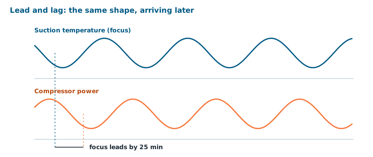
Lead/lag is measured in whole buckets, and the bucket width comes from the range you selected. A wide range gives coarse buckets, so small offsets show as synchronous. If you need finer resolution, choose a shorter range, the console says so where it matters.
The rhythm they share
peak shared period is the timescale at which the two signals move together most strongly, the period of their shared oscillation. A shared 24-hour period usually means both are following a daily cycle: ambient temperature, shift patterns, tariff periods. A shared period matching a machine's cycle time points at the machine.
The coherence plot shows this across periods, so you can see whether the relationship lives at one timescale or several.
Whether you can rely on it
Two labels tell you how much weight to put on the result:
| Label | Meaning |
|---|---|
| lasting link | These two stay tied together over the long run rather than drifting apart, a dependable relationship you can lean on. |
| no shared trend | They drift. Whatever short-term similarity exists, they are not tied together over time. |
| consistent | The relationship holds up across the whole range you selected. |
| inconsistent | It shows up in some parts of the range and not others, worth investigating when it appears. |
A relationship that is both a lasting link and consistent is the kind you can build an alert or a soft sensor on. One that is inconsistent is not worthless, it often means the relationship only holds in a particular operating mode, which is itself a finding.
An example, end to end
An engineer investigating rising energy consumption on a compressor:
Run the analysis.
Suction temperature moves first. That makes physical sense and gives a 25-minute early warning.
So it holds across the whole week, not just during one upset. Worth acting on.
Both signals drift up across the week. Shared trend, not a real influence. Set aside.
That one is following the daily ambient cycle. Explains part of the pattern, and is not something the plant controls.
Conclusion in one session: suction temperature is the actionable lever, with 25 minutes of warning. Without this, the same conclusion is weeks of exporting and correlating by hand.
Limits worth knowing
- Related is not caused. Two signals moving together can share a cause rather than influencing each other. The analysis narrows the field; a person with process knowledge decides what it means.
- Sparse series are unreliable. Series with too few points in the window are skipped rather than analysed badly.
- The range shapes the answer. A relationship visible over an hour can disappear over a year and vice versa. Analyse over the timescale your question is about.
- What is machine learning?: when a learned model is the better tool than a statistical one
- AI agents: the same analysis, offered to an agent as a tool
- Insights: charting and comparing the series you find
- Functions: turning a confirmed relationship into a computation that keeps running
- Knowledge graphs: recording the relationships you confirm
- Events: the operational context behind a correlation
- Value paths: turning a leading indicator into an alert