Insights, charting and live data
Insights is where you look at data. Select one or more time series, choose a time range, and read the chart.
Two things make it more than a chart viewer: you can put several series on the same axis to see how they move together, and you can switch to Live to watch readings arrive in real time.
Picking a time range
Set a Start and End directly, or use a quick range:
| Short | Last 2 minutes · Last 5 minutes · Last 15 minutes · Last 30 minutes · Last hour · Last 3 hours |
| Operational | Last 12 hours · Last day · Last 2 days |
| Analytical | Last week · Last month · Last 3 months · Last year |
| Custom | Any start and end you choose |
There is also a week picker, useful when an investigation is framed around a specific production week rather than a rolling window.
Longer ranges are drawn from wider aggregation buckets. That is what keeps a year of one-second data readable, but it means fine detail is not visible at long ranges, and it matters for relationship analysis, where the bucket width sets how precisely a lead or lag can be measured. When you need detail, narrow the range.
Comparing several series
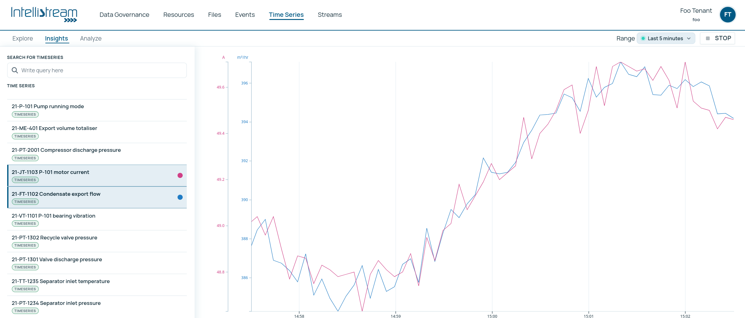
Select more than one series and they are plotted together, up to six at a time; the console warns and asks you to deselect one before adding a seventh. The default range on opening is the last day.
Comparison is where most operational insight actually comes from. A single trace tells you what happened; two traces tell you whether it happened because of something else. Suction pressure against discharge pressure, motor current against throughput, ambient temperature against energy consumption, the pairing is the analysis.
When you want suggestions for what to compare against, the Analyze tab ranks other series by how strongly they move with the one you have selected, so you do not have to guess. Relationship analysis →
Live mode
Click Live to stream new datapoints onto the chart as they arrive, rather than requesting a fixed window.
- Select at least one series first, Live has nothing to stream otherwise.
- Any preset up to one hour works while live, plus growing, which keeps everything since you started and extends the axis as time passes. A longer selection snaps to 15 minutes when you go live.
- The button shows Connecting… while the connection is established, then streams. Click Stop to return to a static view.
Live mode is genuinely live, readings appear as the platform receives them, not on a refresh timer. It is the right view for commissioning, for watching a machine through a start-up sequence, or for following an incident as it develops.
Under the hood this is a data subscription, the same push-not-poll machinery your systems and agents can consume directly, with millisecond delivery and a position that survives reconnects.
The Analyze view
Alongside Insights there is an Analyze view, which goes past plotting into characterising how two signals relate: correlation, lead and lag, shared periodicity, and whether the relationship holds up over the whole range or only part of it.
That has its own page, because the ideas need explaining rather than just listing. Relationship analysis →
Reading a chart honestly
Three habits that prevent most misreadings:
- Check the range before concluding anything. A dramatic-looking excursion over a 15-minute window is often ordinary noise over a day.
- Check whether the series is a step series. A step series holds its value between readings; a non-step series is interpolated. The same underlying data looks different under the two, and the difference is meaningful for anything with discrete states.
- Look for gaps, not just shapes. A flat line can mean a stable process or a dead instrument. Note the window and check the event log over the same range; a maintenance job or a comms fault usually tells you which. Drawing those events onto the chart itself is on the roadmap; today the two are read side by side.
Reports
Charts are how you look; a report is what you hand to somebody else. Today the platform gives you the raw material, the series, the figures and the events that explain them, and the assembly is yours, through the console, the API or an agent that drafts the report for you.
Reports that build themselves are planned. The shape we are working towards: a report that assembles its own figures from the model, goes to a person for approval before it goes anywhere else, and treats the feedback it gets, accepted as written, corrected, rejected, as a signal to learn from. Combined with lineage, every figure in it will name its inputs.
Where agents help
Charting is a human act, but choosing what to chart is a question. If the console assistant is enabled for you, asking it in words is often faster than building the comparison by hand: it looks the series up, answers from the data, and can hand you a button that opens this screen with those series and that window already selected. The console assistant →
- Time series: creating the series you are charting
- Relationship analysis: finding which signals move together
- Events: the context that explains what a chart shows
- The resource graph: navigating from equipment to its measurements